Introduction
In this guide, you will use Python and Jupyter Notebooks to quickly visualize a CSV dataset. These tools combined with the vibrant ecosystem of python libraries for data science provides a powerful way to understand large data sets. This guide will show you how to get started by loading a CSV data set, setup Jupyter Notebooks and visual the data with a notebook. Along the way we will also use Anaconda to manage python versions and libraries. All of the commands are for MacOS but can be adapted for other operating systems.
When you’re finished, you’ll be able to create scatter plots to visualize patterns in a CSV data set.
Prerequisites
Before you begin this guide you’ll need the following:
- A local development environment for Python 3
- A package manager for Python which will most likely be pip or anaconda. Anaconda is recommended for Jupyter Notebooks so I will be using anaconda to install packages.
Step 1 — Setup Jupyter Notebooks
In this step we are going to install Jupyter Notebooks, a web application that runs on a local web server. Jupyter Notebooks are a convenient way to building a single document containing live code, data visualizations and text notes to document the process with minimal effort. More info available at jupyter.org
Let’s get started with installing Jupyter Notebooks:
First navigate to a directory where you want to store your Jupyter Notebook data. For instance, you could create a directory within a project titled notebooks where Jupyter Notebook data is stored for that project and can be included in version control.
For this guide we will create a directory named cameras since we will be working with camera data:
mkdir cameras && cd cameras
Install Jupyter using the anaconda package manager:
conda install jupyter
If you encounter any issues with installation more help is available for installing notebooks
Now we will start the local notebook server using a jupyter command:
jupyter notebook
Some logging information will be written to the console along with a local url you can use to access the app at localhost:8888
After accessing the app in your browser, click on the New button in the upper right and choose Python 3 to create a new notebook.
In the first cell on the page enter the following to test your installation:
print "Hello World"
Finally tap the Run button in the menu at the top of the page and you should see a similar output as shown below.
 Jupyter Notebook hello world example
Note that variables are available globally in the Jupyter Notebook, so the results of previous cells can be referenced in other cells.
In the next step we will import a csv file so we have data to visualize.
Step 2 — Import Data From a CSV File
In this step we will import data from a CSV file into our Jupyter Notebook using Python. The dataset we will use is in a comma-separated values file known as a CSV file. This is a small dataset that lists 13 properties for 1000 cameras.
Download the dataset from Kaggle and place in the directory where you started Jupyter Notebooks. In our case this will be the cameras directory.
To import the CSV data, we will use the Pandas data analysis library. Install Pandas with the following command:
conda install pandas
Go back to your open notebook in the browser and enter this python code in an empty cell to read the CSV file.
# import the pandas data analysis library and refer to it as pd
import pandas as pd

# read the csv file
df = pd.read_csv("camera_dataset.csv")

# view the first few rows of data
df.head()
Tap the Run button to see the result. Your cell should display the first 5 rows of data as shown below.
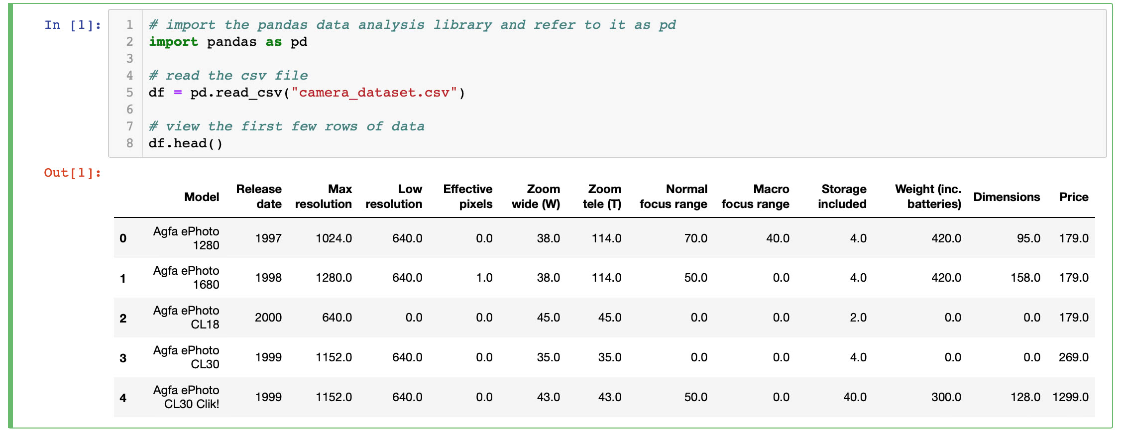 CSV data first 5 rows
The df variable now contains a Pandas DataFrame.
Now we have read a dataset into our notebook and are ready to start analyzing the data.
Step 3 — Exploring Data with the Pandas Library
We imported the Pandas library in the last step and used it to read a CSV file. There is much more we can do with Pandas to manipulate and clean our data. We’ll only cover a few items here but you can learn more from the pandas website
First we can take a look at the data type of each column contained in our DataFrame. Enter this code into the next empty cell in your notebook.
# display the data type of each column in our DataFrame
df.dtypes
Tap the Run button to see the result. Your output should look like this and give you an idea of the type of data we have to work with now.
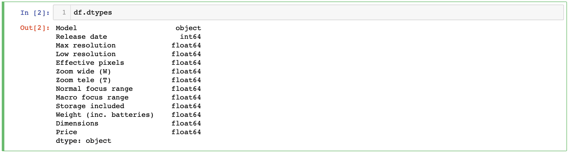 panda dataframe dtypes
If we only want to compare a subset of columns from our data, we can use Pandas to do that as well. Simply create a new DataFrame with the columns specified. Enter the code shown below in the next empty cell in your notebook.
# extract a subset of columns from dataframe df
df2 = df[['Model', 'Max resolution', 'Price']]

# view the first few rows of data
df2.head()
Tap the Run button to see the result. We now have a new DataFrame df2 that only contains the Model, Max resolution and Price columns. Your output should look show the first few rows as shown below.
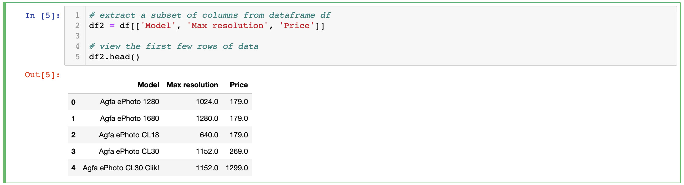 dataframe subset df2
Now we are ready to take this subset of data and create a visualization in the next step.
Step 4 — Data Visualization
In this step we will add 2 Python libraries for plotting and visualizing data, and then draw some graphs.
MatPlotLib will be used for plotting while Seaborn will provide a high-level interface for drawing attractive graphics.
Install MatPlotLib and Seaborn using the anaconda package manager:
conda install jupyter
It is best practice is to add all of your imports at the top of a notebook but for this exercise enter this code into the next empty cell in your notebook:
# Matplotlib is a Python 2D plotting library
import matplotlib.pyplot as plt

# Seaborn provides a high-level interface for drawing attractive and informative statistical graphics
import seaborn as sns
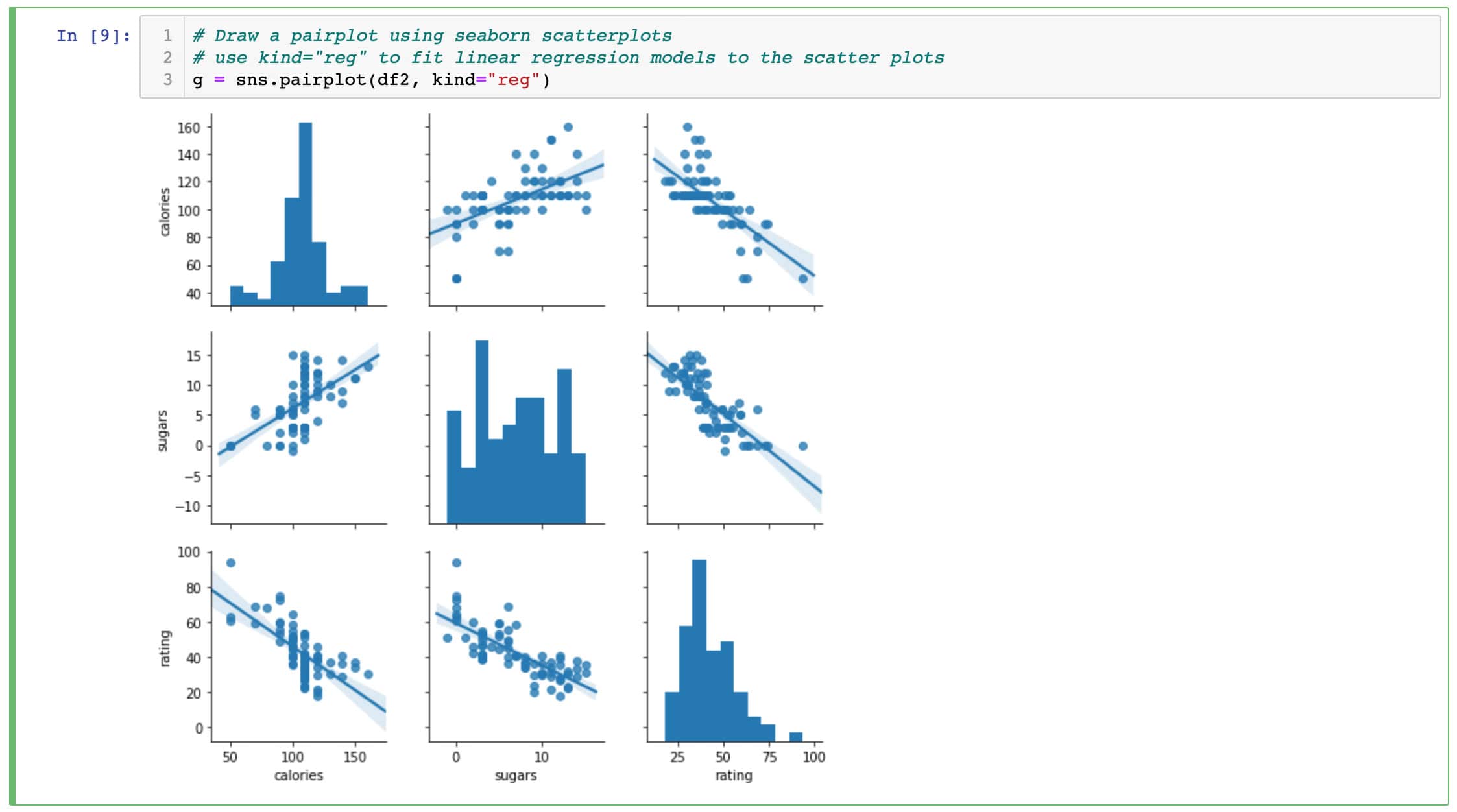
Now you will create a pairplot which consists of a scatter plot for each variable in our DataFrame df2. Providing the argument kind=“reg” will fit linear regression models to the scatter plots. This gives you an informative view into your data for a small amount of effort.
Enter this code into the next empty cell:
# Draw a pairplot using seaborn scatterplots
# use kind="reg" to fit linear regression models to the scatter plots
g = sns.pairplot(df2, kind="reg")
Tap the Run button to see the result. Your output should look like this and provide a great starting point for exploring this dataset.
pairplot results
Conclusion
In this article you setup Jupyter Notebooks, installed the Pandas library to import CSV data from a file and create a Data Frame, and then finally used Matplotlib and Seaborn to visualize the data. Now you can go further explore many more types of visualization by reading the Seaborn documentation.
There are a great number of resources for Python data visualization and a few are listed below.
Further exploration
Jupyter Notebooks
Everything you need to know about scatterplots
Documentation for Seaborn pair plots
Beyond visualization, scikit-learn is popular open-source Machine Learning library in Python
If you have suggestions or topics you want covered please contact me. 🙂